How to group mixed power circuits in a flexible way?
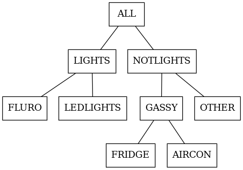
Imagine we have a schematic like this:
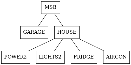
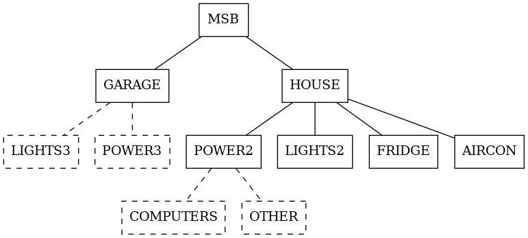
Everything is monitored via a CTs (power sensors). But that’s not the whole story. We have mixed loads. These non-differentiated loads are shown dashed:
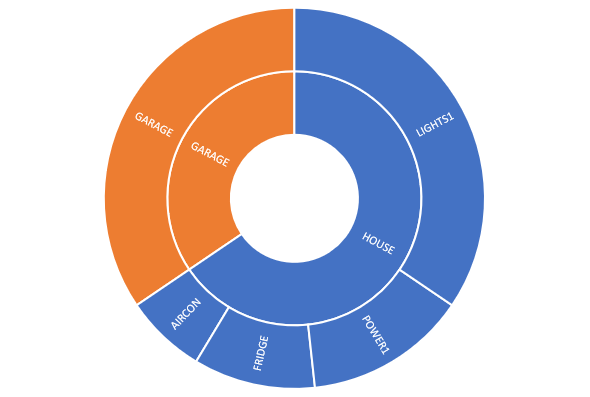
Ok. Now we want to analyse “this data”. By “this data” I mean we have a reading (power or energy) at the solid nodes, since we have sensors there. Then we want to apportion this (estimating) to get a grouped, multi-level breakdown. Or Sunburst! It’s a nice way to show hierarchial data.
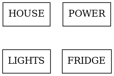
We can just use the existing breakdown, which is identical to the tree.
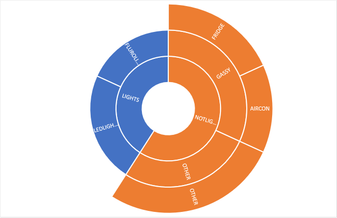
We really want arbitrary grouping and apportioning. Often the monitoring hierarchy is not the hierarchy we actually want. For example we might want a different kind of breakdown of that same data:
Generalise Me, Baby
Ok, so really, we want to map a non-hierarchical list of sensed values (LIGHT1, POWER1) into a apportionment tree:
—> map into this breakdown —>
Let’s assign portions on the left. That is, for each value, divide its value into the boxes on the right. (An alternative would be ‘pulling’ from the RHS.) Doing it on the left means we can easily ensure 100% of value is apportioned.
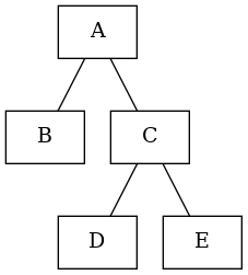
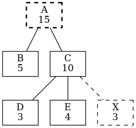
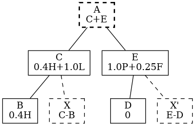
What about hierarchy? For example, we assign values to B D E. Should C and A be derived via summing children? Yes, if there is no reading for A or C it’s straightforward:
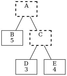
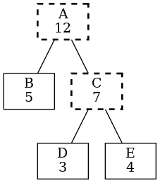
Ok that’s great. But ……what if there is a reading for C, and it’s not 7?
Say it’s 10! OMG.
There must be a mystery load, so we should show the graph on the right where:
B C D E (solid) are measured
A (bold-dash) is calculated as before
X (dash) is implied
To apportion, we assign any number of nodes to a metric. The sum should be 100%.
Notice at this stage there is no hierarchy. In other words, the hierarchy we create with ABCDE will determine how to handle implied and calculated nodes.
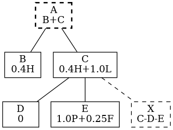
First we work out the raw values. For example
C = LIGHTS x 1.0 + FRIDGE x .75
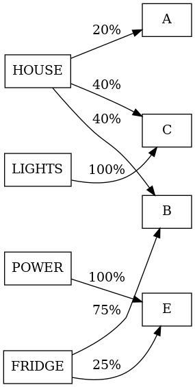
So we’d get the graph on right.
If we keep the apportionment the same, but change the hierarchy? Let’s see on the right.
Ok, good, it’s different because although the measurements are the same, the derived nodes change due to their relationships.
To work out an algorithm for this we might start at the leaves and move up, adding inferred nodes and calculating summed nodes. (There are maybe some edge cases like D=null or multi-level chains. We’ll cross that bridge…)
Applications
This might enable us to just handle multi-level consumption. So we measure nodes (circuits) at-the-site and upload to a database. (We already do this, but are limited to a ‘single layer’: all consumption circuit should add to 100% of consumption). Perhaps we throw all the sensor values into the database and dynamically map as shown.
This would just apply to consumption metrics. We’d still use Import/Export/Production/Consumption. Solar and Export are usually not broken down.
An extension would be to break down import (i.e. which circuits import – not just consume – energy). Dunno if that’s possible. Would be cool to say “oh nice, my hotwater is a big consumer, but small importer…my timer works”
Example
For now, let’s do a worked example on consumption to see if all this guff actually works out. I’ll use a real example (my house!).
Here are all the sensors for the period 11 May 2023 to 10 June 2023. Consumption is derived, and Import/Export are just unsigned Net. Let’s first map values to the metering hierarchy
| Sensor | kWh/day |
| Aircon | 2.5 |
| Fridge | 2.1 |
| Garage | 1.2 |
| Hotwater | 1.6 |
| House | 14.1 |
| Lights | 2.1 |
| OvenStove | 1.6 |
| Powerpoints | 3.9 |
| Production | 12 |
| Net | 2.5 |
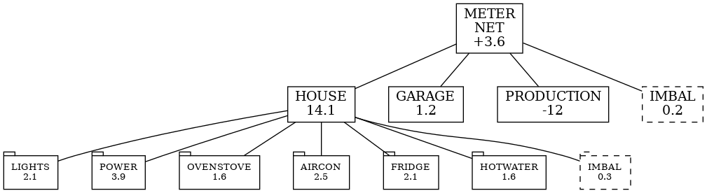
We focus on consumption breakdown. Let’s apply our method.
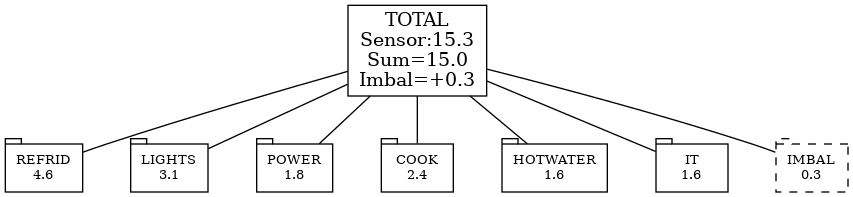
First, we select the categories: REFRIDG, LIGHTS, HOTWATER, COOKING, COMPUTERS, POWER. Then we apportion our measurements on the right.
Then we make layout the nodes and calculate values. For example, LIGHTS category is =1.2*0.5+2.1+0.39=3.1
Note that “Garage” goes to two levels! So it’s 200% Whoa!
This is higher than the LIGHTS sensor because there are lights in the garage and on powerpoints, which we estimated as fractions of those sensors.
| Sensor | 1 |
| Aircon | 1.0 R |
| Fridge | 1.0 R |
| Garage | 0.5 L 0.5P 1.0T |
| Hotwater | 1.0 H |
| HouseBoard | 1.0T |
| Lights | 1.0 L |
| OvenStove | 1.0 C |
| Powerpoints | 0.4 IT 0.3 P 0.2 C 0.1 L |
| Production | – |
| Net | – |
This is just a two level breakdown. But it would be the same for many levels.
Since we didn’t have a ‘total’ sensor, we uses House and Garage to get the expected total and then could find the Imbalance of 0.3.
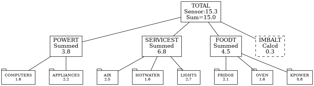
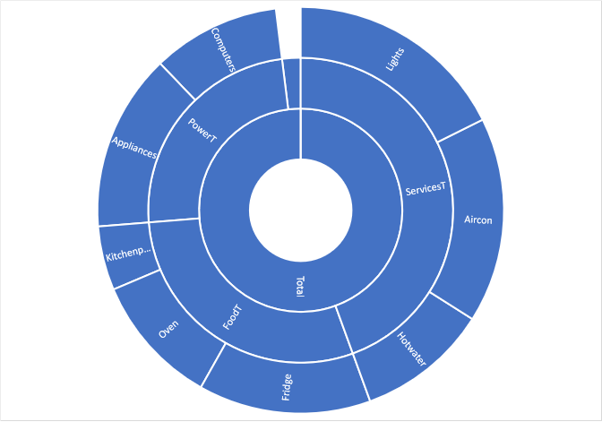
Let’s do a different breakdown of the same data. We’ll try a multi-level breakdown on the right. We apportion to L2 nodes. L1 nodes (Power, Services) at calculated from the leaves as we don’t have any sensor there.
At L0 node (total) we have a sensor and so can derive any imbalances.
Let’s represent this as a sunburst and a equivalent as a tree:
| Sensor | kWh/day | L2 |
| Aircon | 2.5 | 1.0AC |
| Fridge | 2.1 | 1.0F |
| Garage | 1.2 | 0.5A 0.5L |
| Hotwater | 1.6 | 1.0H |
| HouseBoard | 14.1 | (L0) |
| Lights | 2.1 | 1.0L |
| OvenStove | 1.6 | 1.0O |
| Powerpoints | 3.9 | 0.4C 0.4A 0.2K |
Implementation
API
‘How to design an Rest API that provides a broken-down graph based on a supplied set of Appointionments and a Breakdown?
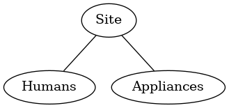
Let’s look at the data flow. We name the components:
Measurement: a real sensor measurements for a metric (e.g. circuit). Available to the API via a query to the database. In any unit (kWh, kWh/day, W, etc)Categorys: in a tree, a category (e.g. “Appliances’) no values, just structureBreakdown: tree ofCategorys with derived nodes added.
And then consider a use-case, left to right:
Measurements
From database
Light1: 50
Power1: 25
Garage: 100
Site: 200
Breakdown Configuration
Parameter to API via JSON, to be filled in by API and returned
{
  Site: {
    sources {
      Light1: 1.0,
      Garage: 1.0,
      Power1: 1.0
    },
    children: {
      Humans: {
        sources: {
          Light1: 1.0,
          Garage: 0.5
        }
      },
      Appliances: {
        sources: {
          Power1: 1.0,
          Garage: 0.5
        }
      }
    }
  }
}
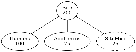
Breakdown (format 1)
Result from API (annotated dot graph as .dot or .png)
Breakdown (format 2)
Result from API (JSON). Adds to provided Category Tree
  Site: {
    value: 200,
    sources: { ...}
    children: {
      Humans: {
        value: 100,
        children: [],
        sources: { ...}
      },
      Appliances: {
        value: 75,
        children: [],
        sources: { ...}
      },
      SiteMisc: {
        value: 25,
        children: [],
        sources: { ...}
      }
    }
  }
Graphing
‘How to take time-series power/energy samples, an arbitrary hierarchy and apportionment, and produce a graph?’
Existing tools:
- InfluxDBv2 can provide the sensor data (e.g 2.4kWh/day for “Lights” sensor). But that’s it.
- Grafana might be able to directly render a sunburst, but not recent plugins (?) (as of 2023). This would be best as I already use Grafana.
- Plotly.py could do it. There is a whole ecosystem of options, but Python webapp (maybe substituting existing Django for ‘Flask’) might be good.
For both Grafana and Plotly, and I guess any grapher, we need three sources of information:
- The ‘core’ data! (just a list of key-values, likely in kWh/day or W)
- A mapping of apportionment from ‘core’ data to ‘nodes’.
- A layout (hierarchy) of the nodes.
Numbers 2 and 3 seem well suited to a JSON (or native Python, really) style representation with dicts and lists. The creation of the nodes’ values via apportioning would easy to do in Python, and allow the logic for finding imbalanced/totals. This would be tricky or impossible without coding (i.e. just in Grafana). Or would need a whole new grafana plugin (gulp).
Some concrete options:
- Grafana with updated sunburst, pulling JSON from a database (e.g. existing db managed by Django’s) and loading with a data source. Many tricky to get working, but elegant.
- Django to serve plotly.py html and javascript pages. Use existing query functions to query influx in Django. Good link to existing and plotly looks cool.
Both options are in-browser viewing. That wouldn’t port to Flutter for an App. Probably best to use ‘native’ flutter widgets for display in-app.